The Best Coaching Website Design: What Actually Works in 2025
Forget cookie-cutter templates. Here’s what makes a coaching website truly magnetic, strategic, and built to scale.
If you’re a coach—whether life, business, health, mindset, or anything in between—you already know the value of creating transformation for your clients. But when it comes to your own transformation? It often starts with the place most people meet you first: your website.
In 2025, your website isn’t just a portfolio or digital business card. It’s your most powerful marketing tool. And if designed intentionally, it becomes your brand’s home base—a place that attracts, nurtures, and converts your dream clients without you needing to be online 24/7.
But what actually makes a coaching website great? What design principles and strategy do you need to stand out, build trust, and generate leads in a saturated space?
Let’s break it down.
What Makes a Coaching Website the “Best”
Before we jump into fonts, colors, or layouts, let’s get clear: a high-converting, elevated coaching website does three things exceptionally well:
-
It clearly communicates your unique value.
-
It builds trust through cohesive visuals and messaging.
-
It guides users toward taking meaningful action (booking a call, signing up, buying a product).
Yes, design matters—but design without strategy is just decoration. The best coaching websites blend both: form and function, beauty and brains.
The 6 Core Elements of the Best Coaching Website Design
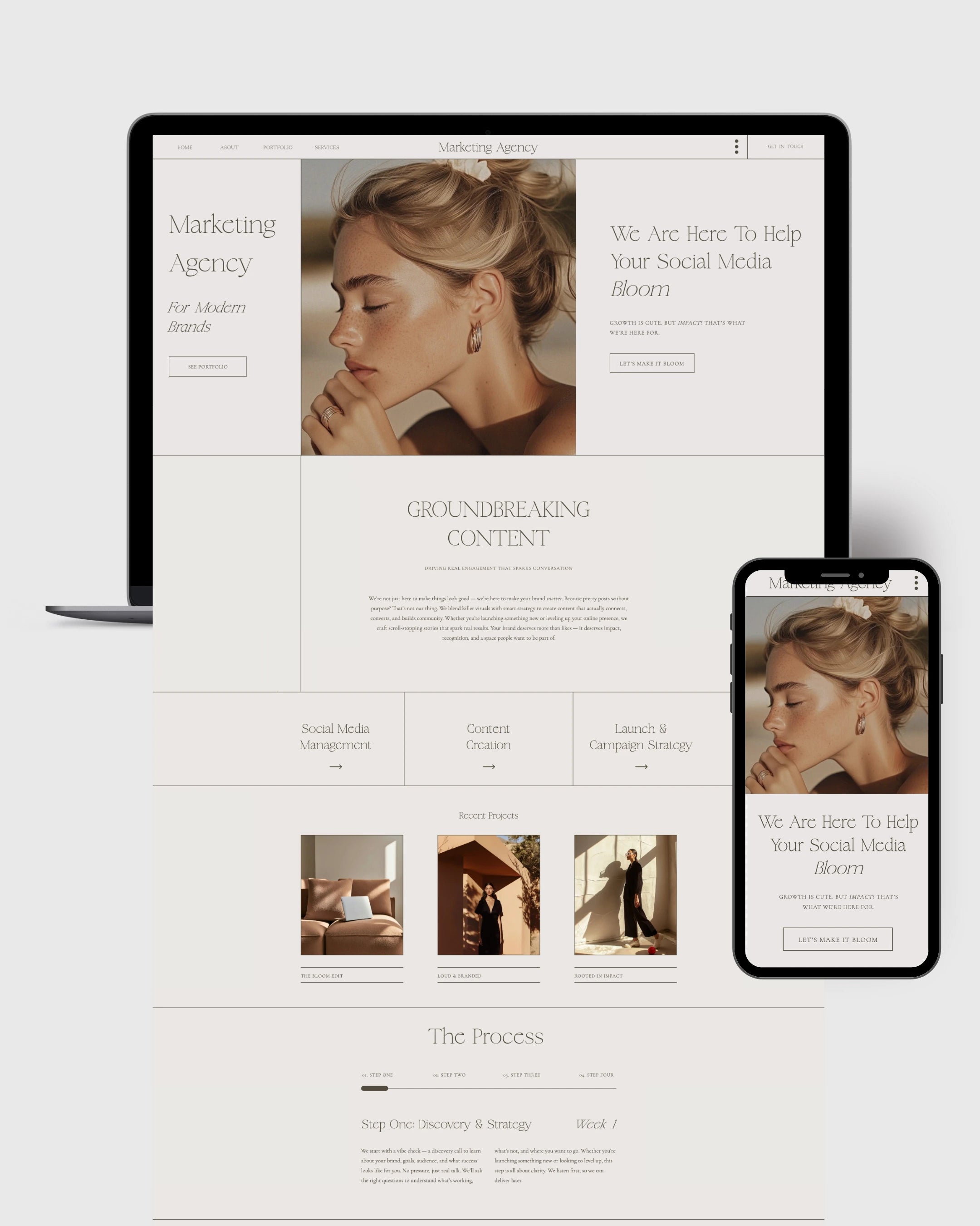
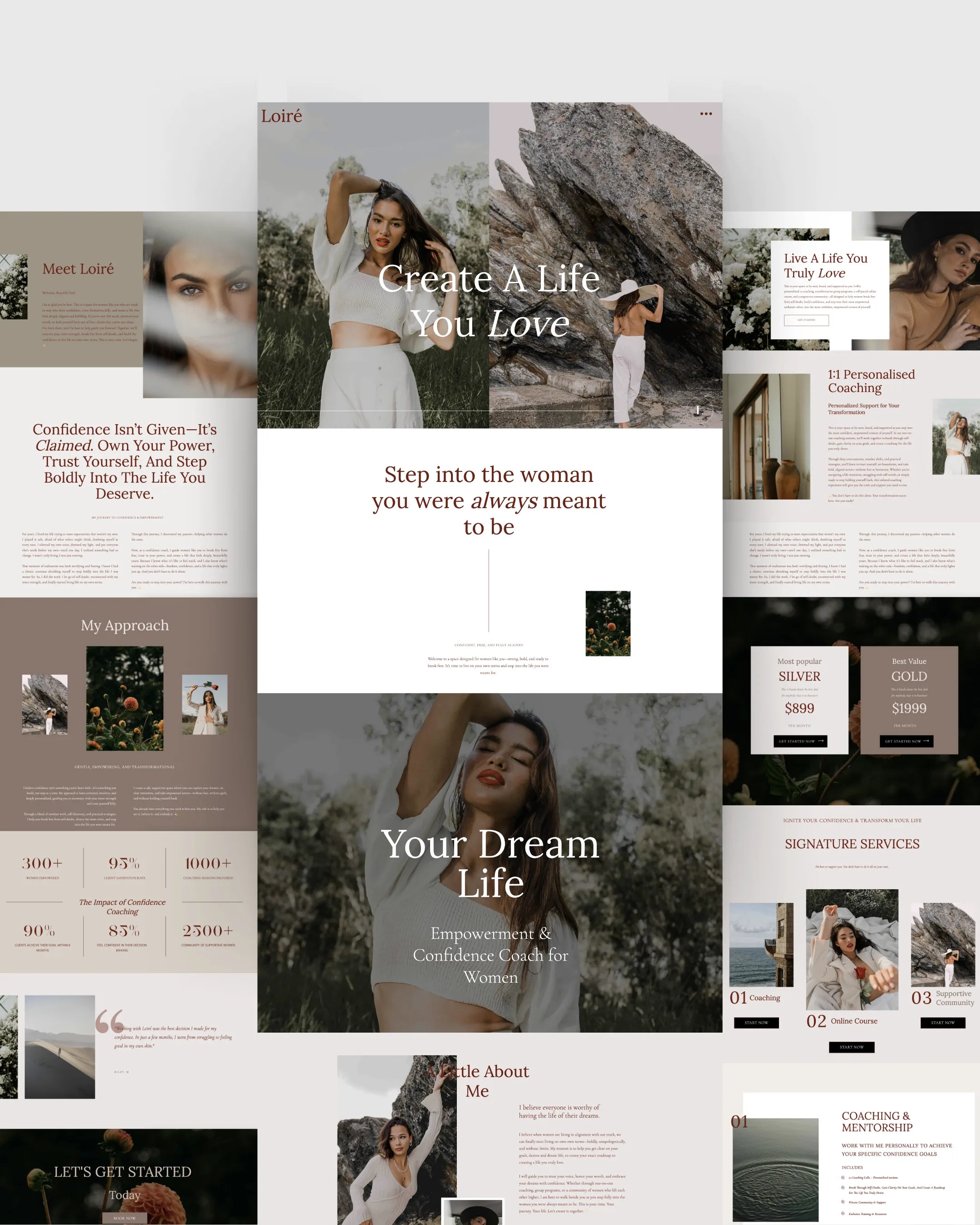
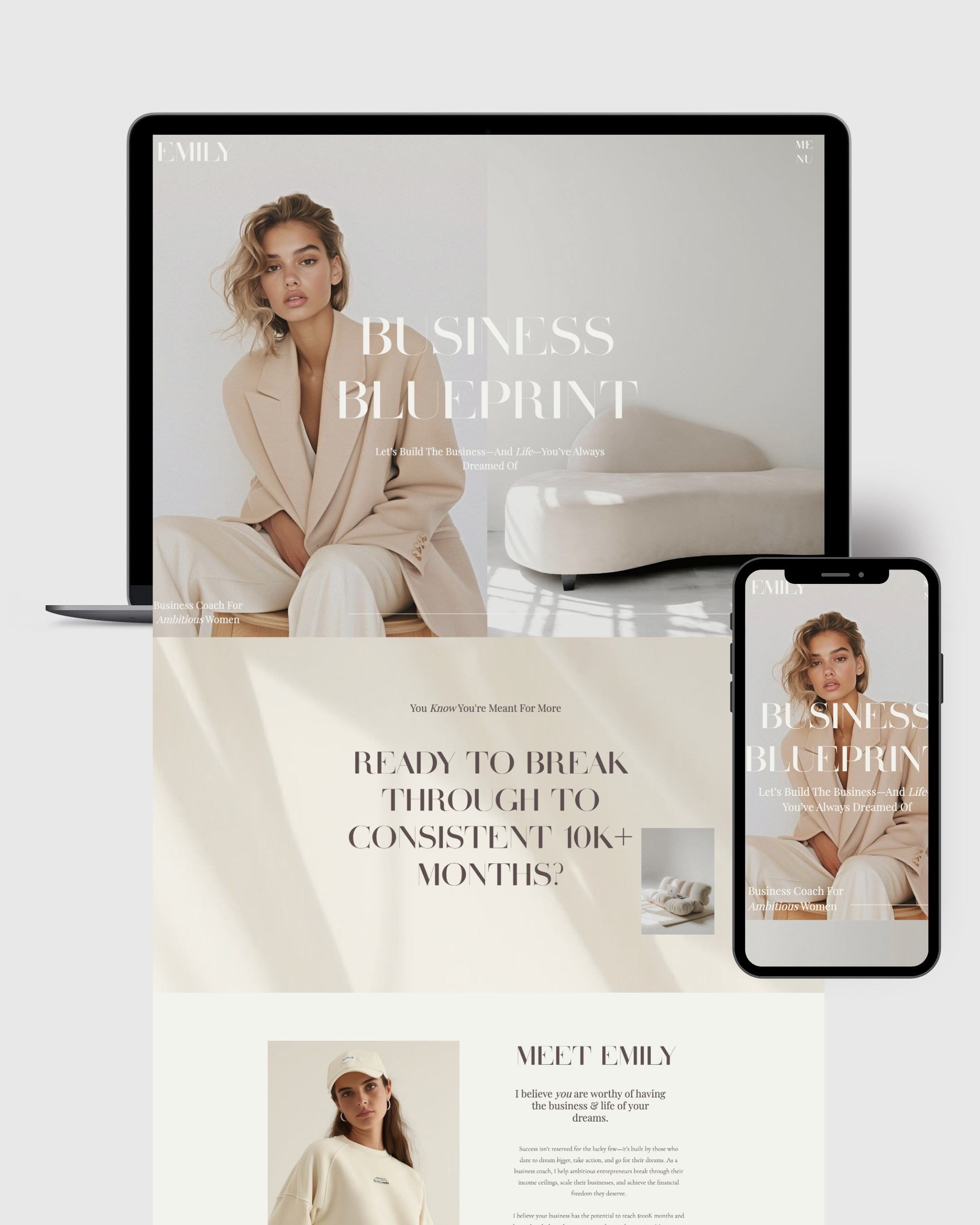
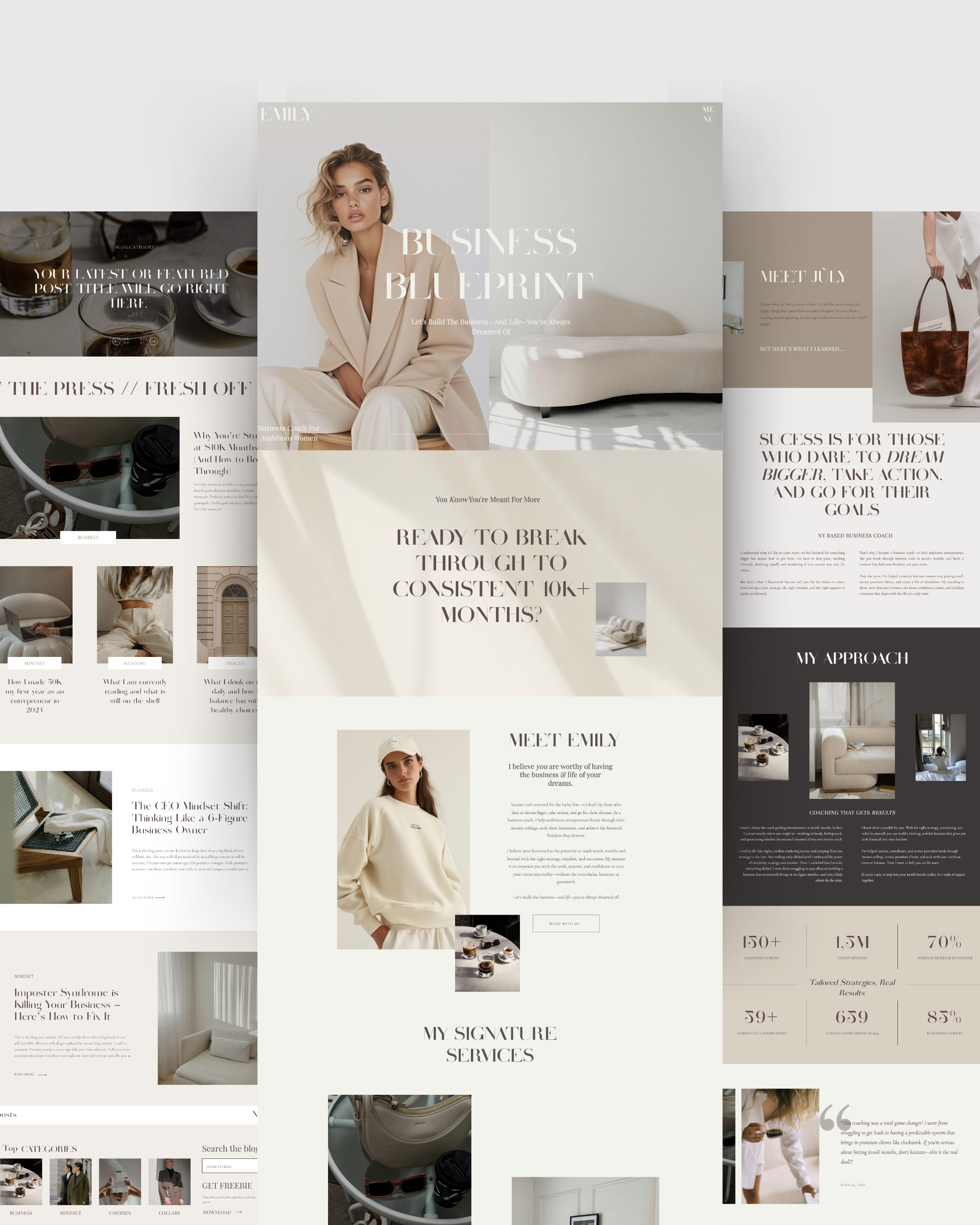
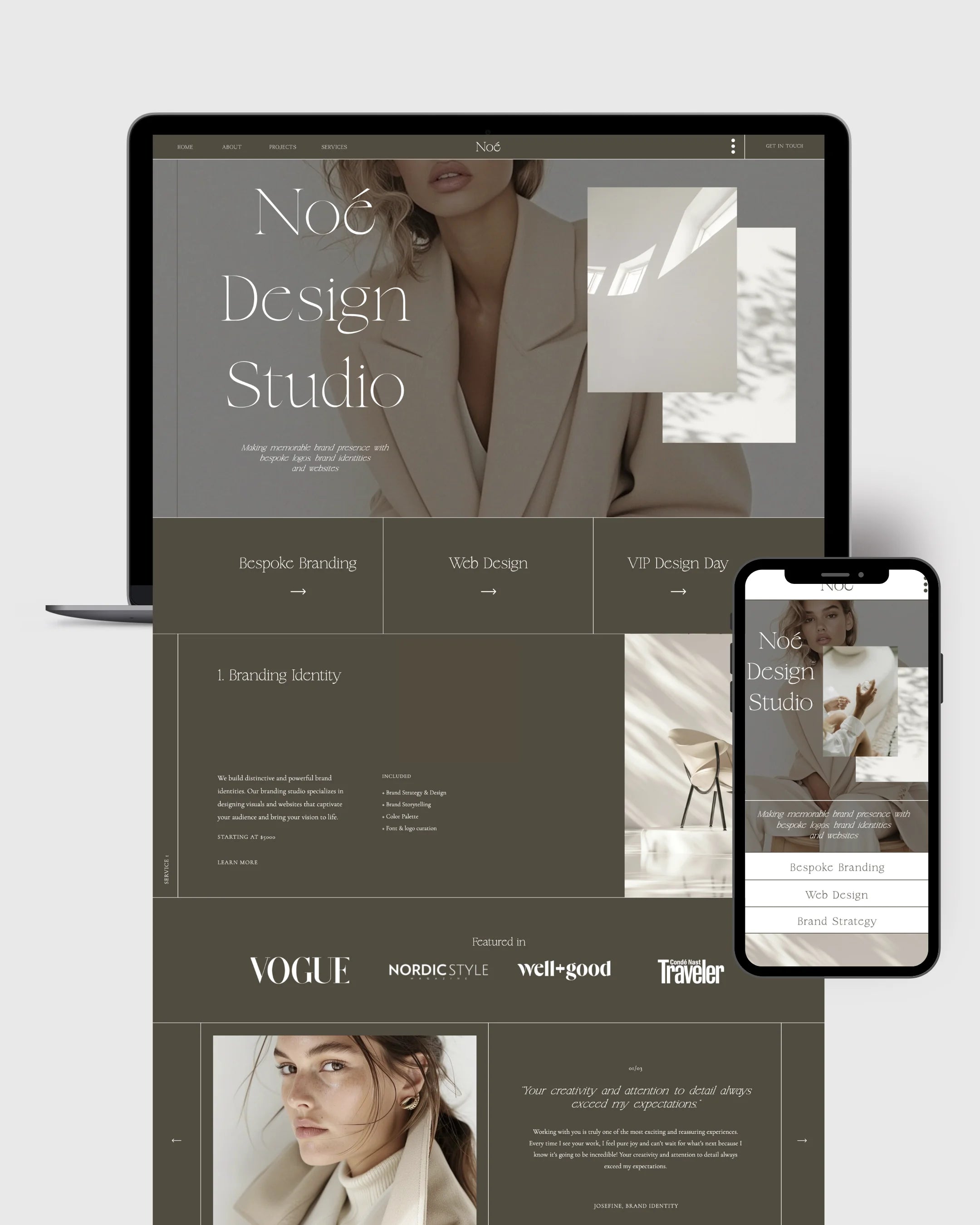
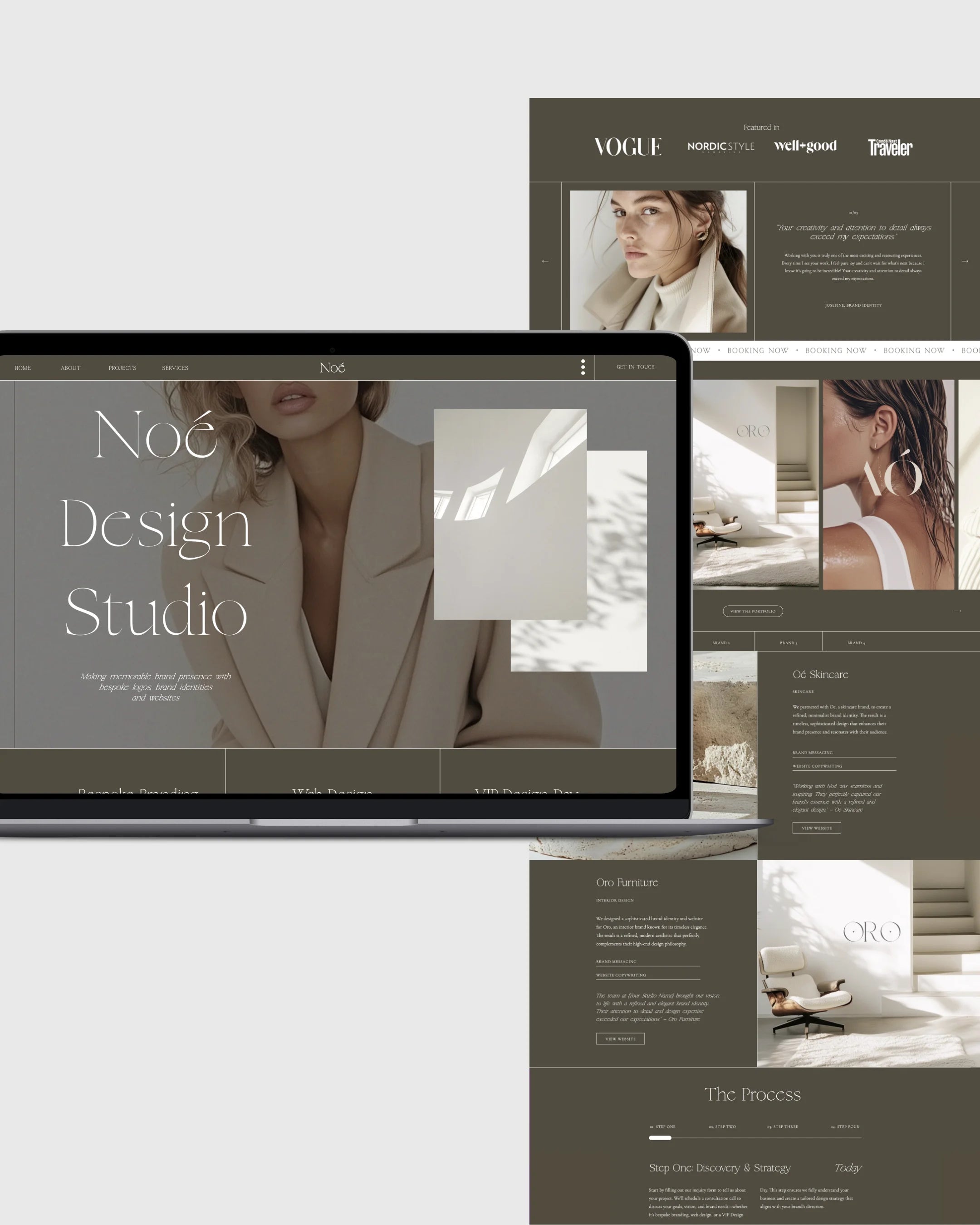
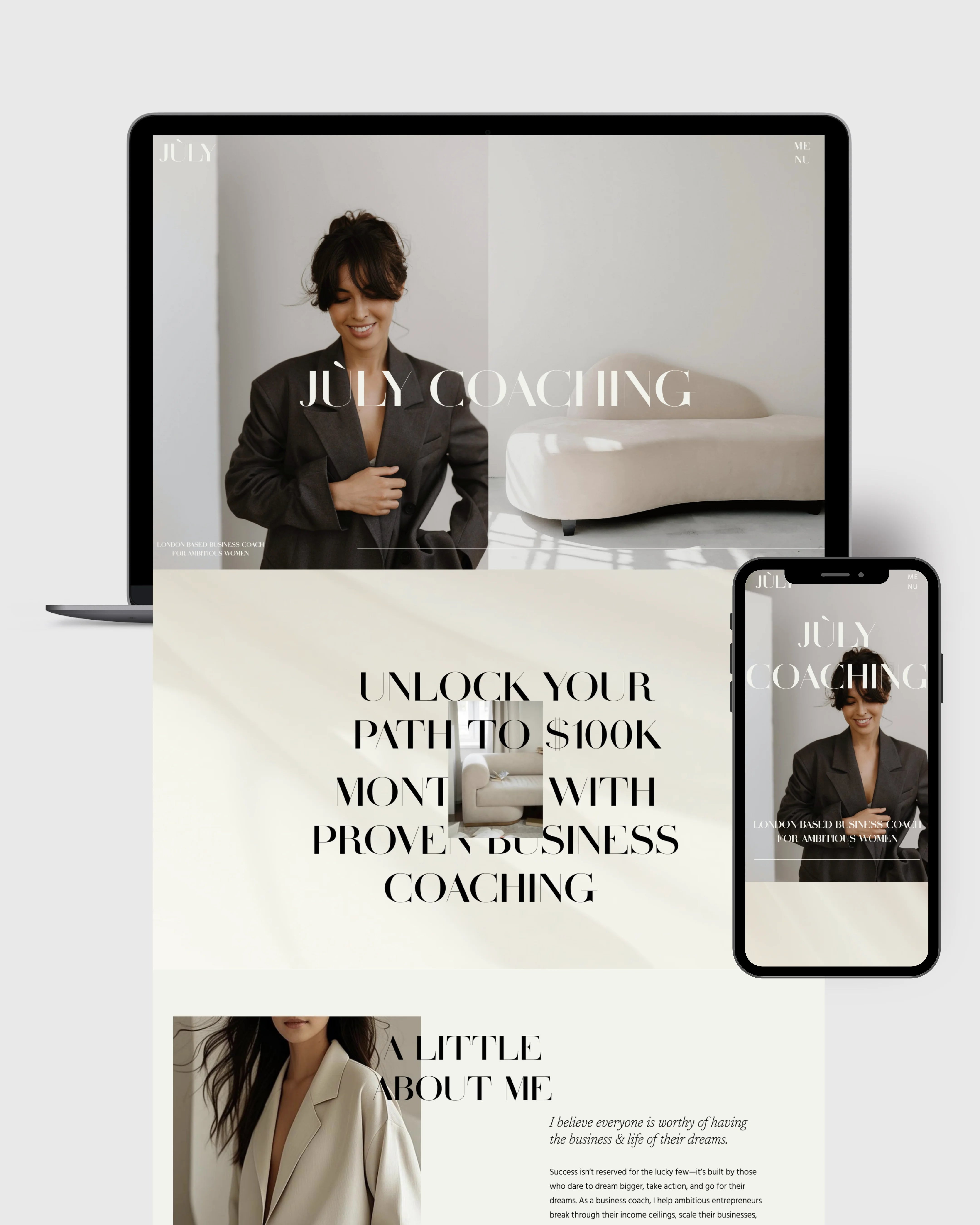
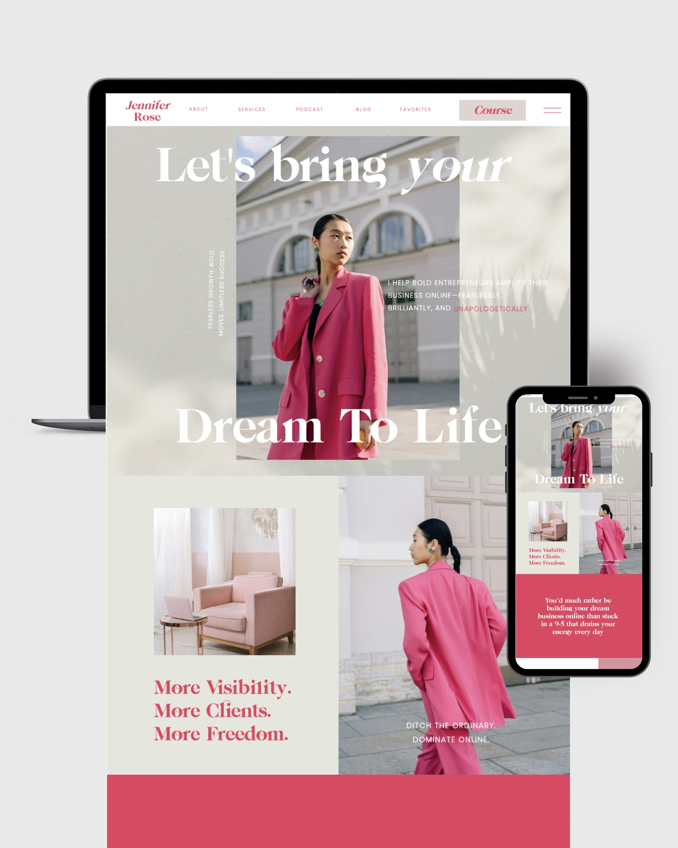
1. A Clear and Compelling Hero Section
The top of your homepage is prime real estate. In just a few seconds, your ideal client should understand:
-
What you do
-
Who you help
-
How you help them
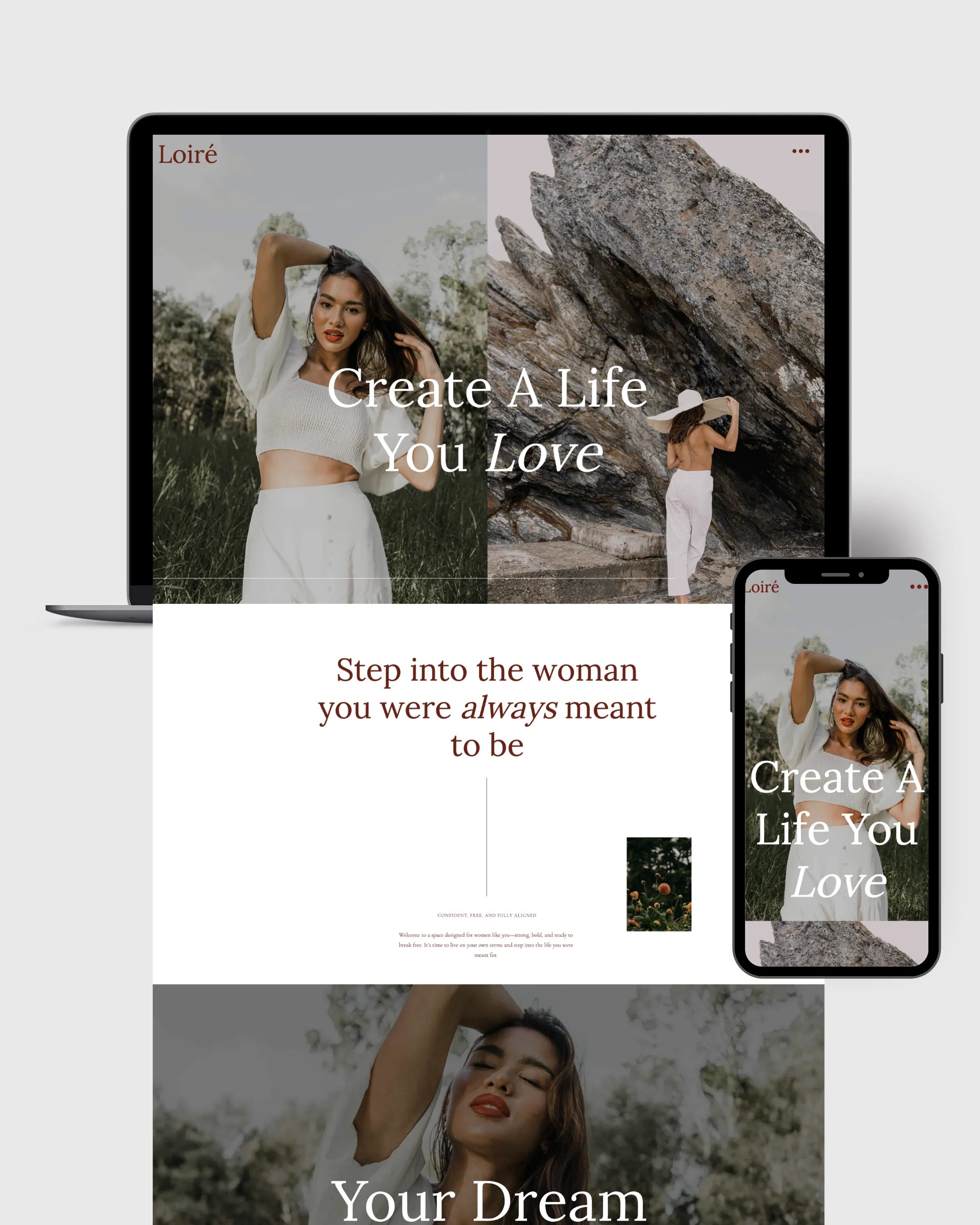
Your headline should be bold, benefit-driven, and emotionally resonant. Pair it with a short subheadline and a powerful call-to-action. Use visuals (either a high-quality brand photo or a subtle, branded background) that evoke trust and connection.
Example: "Helping ambitious women coaches scale to 6-figure months—without burnout."
CTA: “Book Your Free Strategy Call” or “Explore My Signature Program”
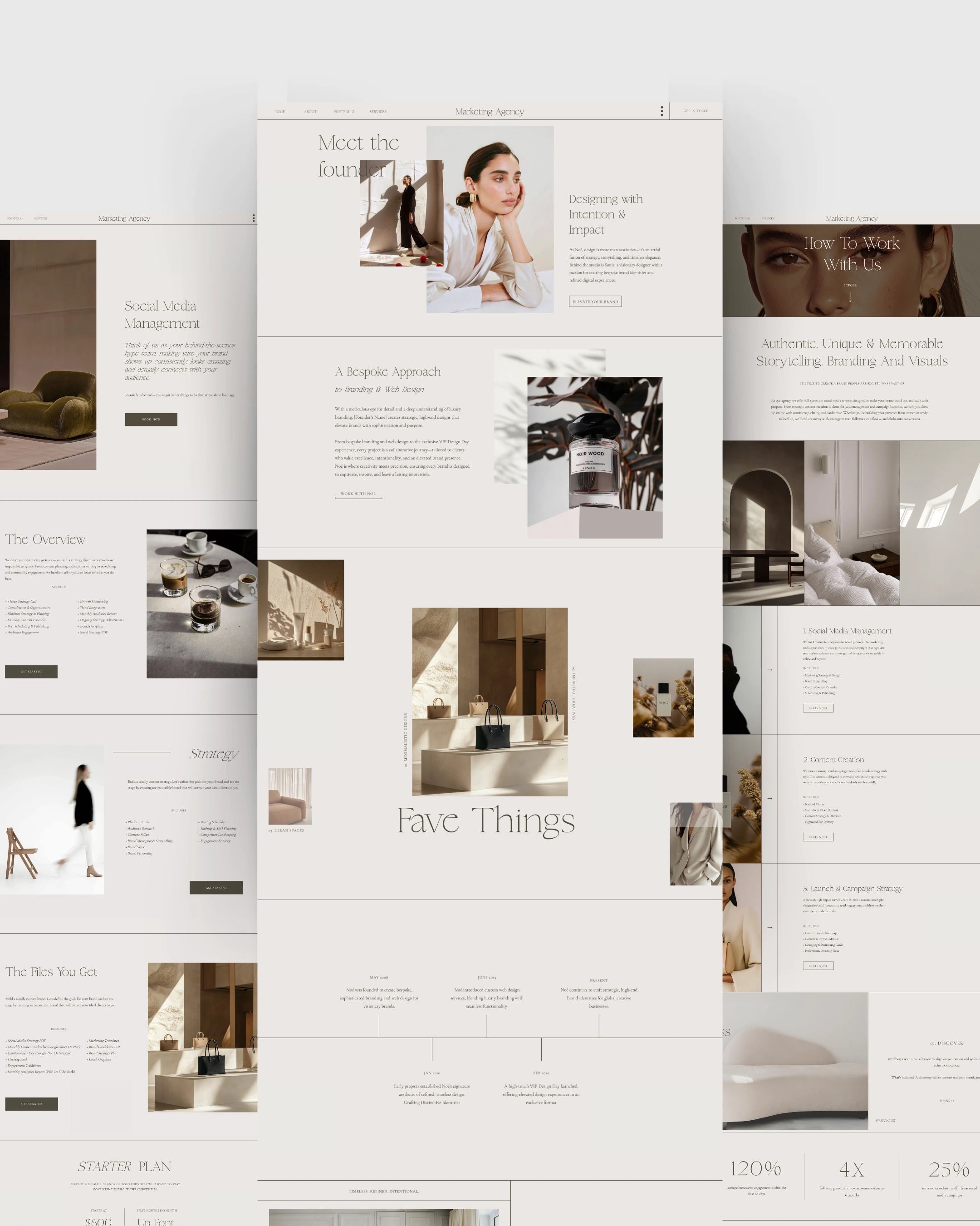
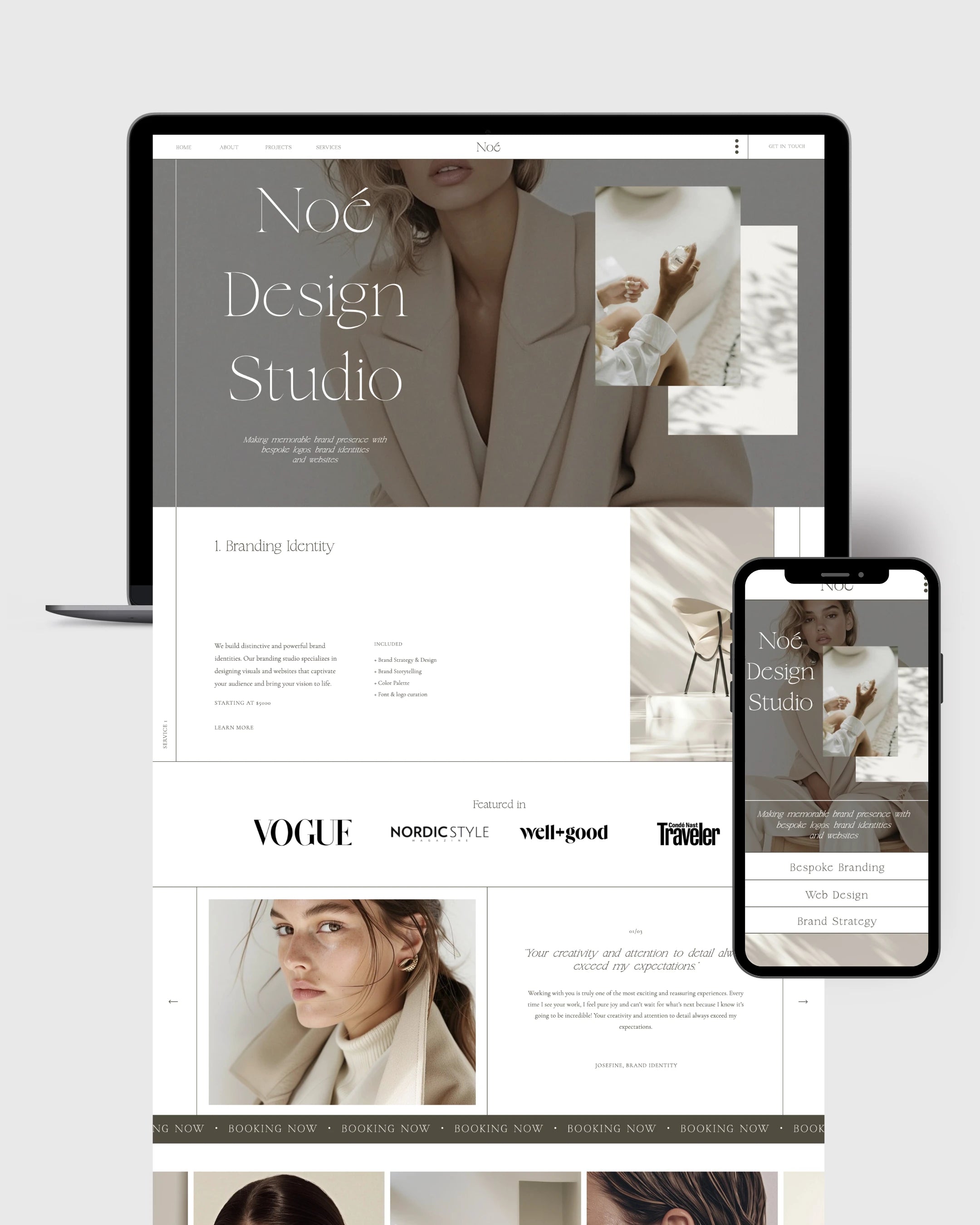
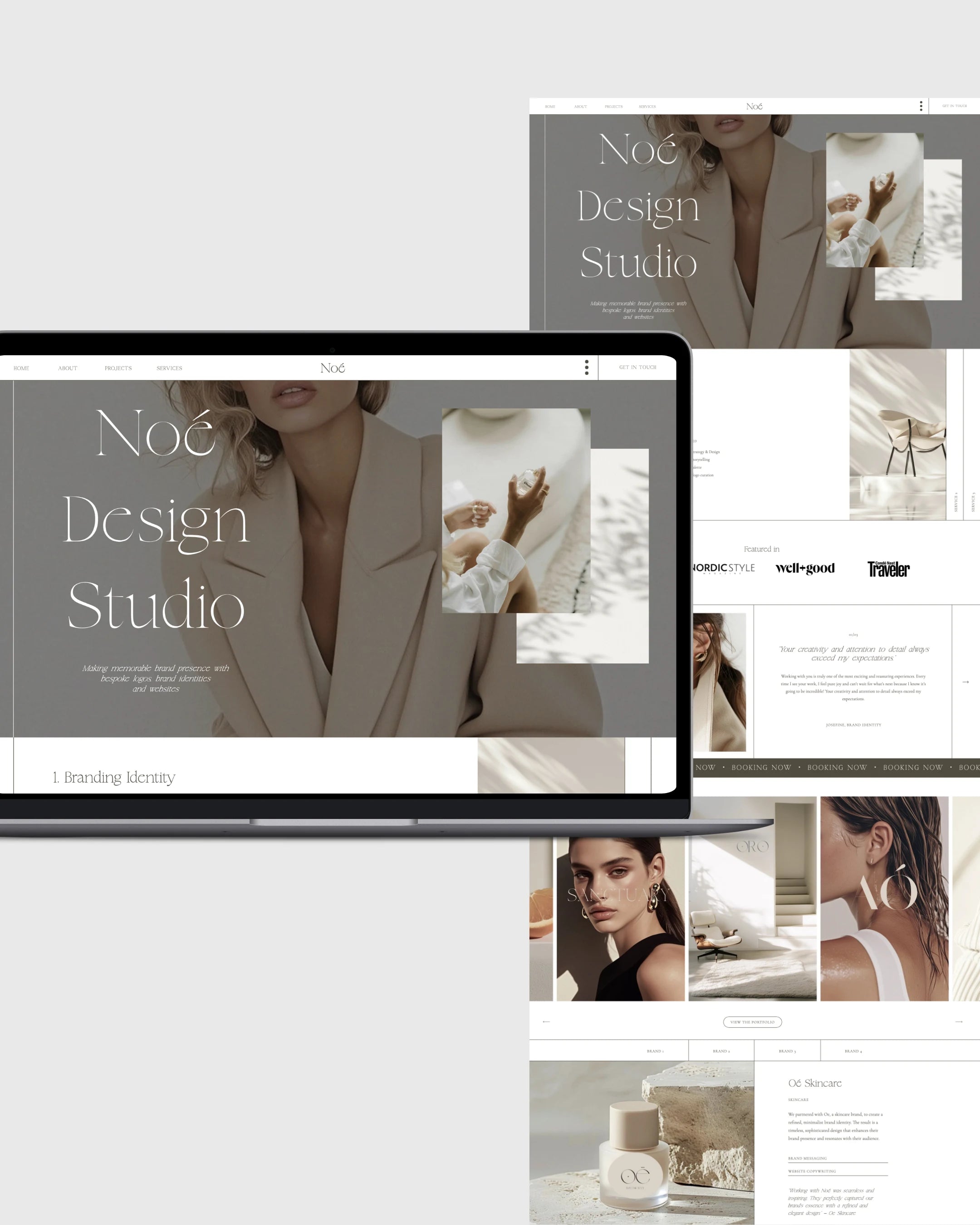
2. Strategic Visual Identity
Great design starts with alignment. Your fonts, colors, and imagery should reflect your brand personality—and speak to the aspirations of your ideal client.
-
Fonts: Choose one strong serif or sans-serif for headlines, paired with a clean body font.
-
Colors: Use 2–3 brand colors that reflect your energy (think: feminine and luxe, grounded and calming, bold and high-performance).
-
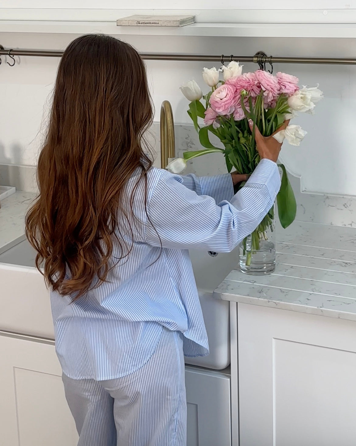
Imagery: Use brand photography that feels authentic, polished, and personal.
The goal? To make your site feel like you—while signaling the quality of transformation you provide.
3. Magnetic, Heart-Centered Messaging
Design draws them in, but copy is what converts. Your words should:
-
Speak directly to your dream client’s desires and pain points
-
Position you as a relatable expert
-
Move visitors from curiosity to clarity to commitment
Use language that’s both clear and emotionally resonant. Every section—from your about page to your program descriptions—should be infused with messaging that builds connection and drives action.
Pro tip: Use storytelling. Make your “About” page about them, not just you. Show them how your journey makes you uniquely qualified to help them.
4. Simplified Navigation and Flow
A cluttered website leads to overwhelmed visitors. The best coaching websites have clean navigation and a clear user journey. Your goal is to make it effortless for someone to understand where to go next.
Keep your navigation bar minimal—no more than 5–6 items:
-
Home
-
About
-
Work With Me (or Services)
-
Blog / Resources
-
Contact
And make sure every page has a clear CTA. Don’t make people guess where to click.
5. Compelling Offers and Clear Calls-to-Action
Your services shouldn’t be buried. Feature your offers front and center—with clear explanations of the transformation they provide, who they’re for, and how to get started.
Don’t just list features—sell the results.
Pair each offer with:
-
A clear headline
-
Bullet points of benefits
-
Testimonials or case studies
-
A CTA button ("Apply Now," "Join the Waitlist," etc.)

6. Social Proof That Instills Trust
In the coaching world, trust is everything. The best websites use real, strategic social proof:
-
Written testimonials
-
Screenshots of client wins
-
Before/after stats or stories
-
Logos of features or certifications
Sprinkle these throughout your site, not just on one page. Trust is built through repetition and subtle reinforcement.
Platforms: Why Coaches Are Choosing Showit in 2025
When it comes to building a modern coaching website, Showit website templates is leading the charge—and for good reason:
-
100% drag-and-drop freedom (perfect for non-coders)
-
Integration with WordPress for powerful blogging
-
Stunning design flexibility
-
Great for personal brands and storytelling
Many of the best coaching websites today are built on Showit using a mix of professional templates and custom design.
Examples of Effective Coaching Website Sections
Let’s break down a simple homepage structure that works:
-
Hero Section – Headline, subheadline, CTA
-
Credibility Bar – As seen in, featured logos
-
About Preview – Short intro with link to full story
-
Services Overview – 1–3 core offers with CTAs
-
Testimonials – 2–3 standout client wins
-
Lead Magnet Opt-In – Free resource with form
-
Call to Action – Reiterate transformation, CTA button
Each section should lead your visitor deeper into the experience—and closer to working with you.
Mistakes to Avoid in Coaching Website Design
Even gorgeous websites can fail to convert if they fall into these traps:
-
Too much fluff: Fancy design with no message = confusion.
-
No clear offer: If people can’t figure out what you do, they won’t stick around.
-
Lack of mobile optimization: In 2025, 70%+ of your traffic is on mobile.
-
No email opt-in or list-building strategy: You're leaving leads on the table.
-
Generic copy: If your site sounds like everyone else, it won’t convert.
Avoiding these mistakes alone can drastically increase your leads and conversions.
Final Thoughts: Your Website Is Your Business Partner
As a coach, your greatest asset is your ability to create transformation. Your website should reflect that power—not just in words or visuals, but in strategy.
The best coaching websites aren’t the flashiest. They’re the clearest, the most intentional, and the ones that feel deeply aligned with the person behind them.
When your website reflects your energy, your mission, and your brilliance—your dream clients feel it.
And that’s when the real magic happens.
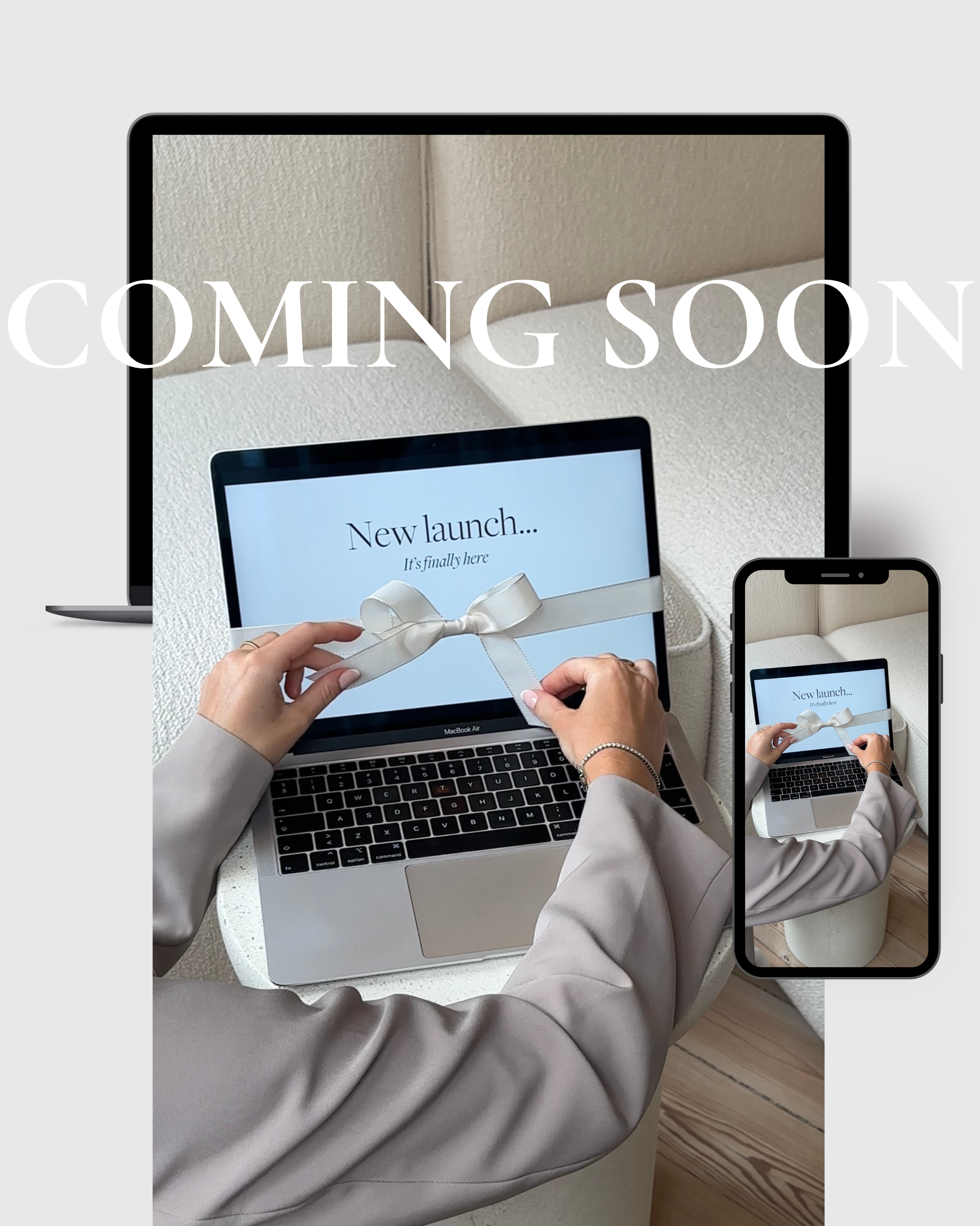
Ready to Build a Coaching Website That Converts?
At Fjōr Avenue, we specialize in Showit website templates designed for modern, ambitious coaches who are ready to scale with intention. Editorial. Elevated. Easy to customize.
Whether you're DIY-ing your first site or ready to upgrade to a design that reflects your six-figure vision—we’ve got a template (and the strategy) for that.
👉 Explore Website Templates for Coaches
Let’s build the website your coaching business truly deserves.
Written by Fjōr Avenue

